
Trebla / Brand & design
Brand guidelines.
Our logo, colors and typefaces, with layout rules for the website and the stories we publish.
Three points. One signature.
Our mark and wordmark stay together wherever Trebla introduces itself. Give them room. Keep their proportions. Use the original artwork.
Keep clear space at least the height of one dot. Use the symbol on its own only when Trebla is already named, such as an avatar or favicon.
Download the logo ↗A little color. A clear signal.
Paper and ink do the reading. Cobalt brings emphasis. Ice gives diagrams and supporting surfaces a softer register.
Ink
Headlines · dark canvas
Paper
Reading · breathing room
Cobalt
Actions · editorial emphasis
Ice
Supporting surfaces · dark links
Midnight
Secondary dark surface
Use one accent per composition. Keep body text on a quiet surface. Color should guide attention without carrying meaning on its own.
Use flat color. Keep gradients and decorative 3D treatments out of the brand templates.
Let the type do the talking.
Two typefaces, with different jobs. Manrope gives the headline its character. Figtree keeps everything else easy to read.
Engineering the future.
ABCDEFGHIJKLMNOPQRSTUVWXYZ abcdefghijklmnopqrstuvwxyz 0123456789 & @ / + =
Short headlines. Tight spacing. Room around every line.
Good software starts with clear decisions.
Use a comfortable line height and a readable measure. Save stronger weights for emphasis, navigation and actions.
Layouts for social.
Large type, short copy and a full-bleed background. Three monochrome variations keep Trebla’s original logo and fonts.
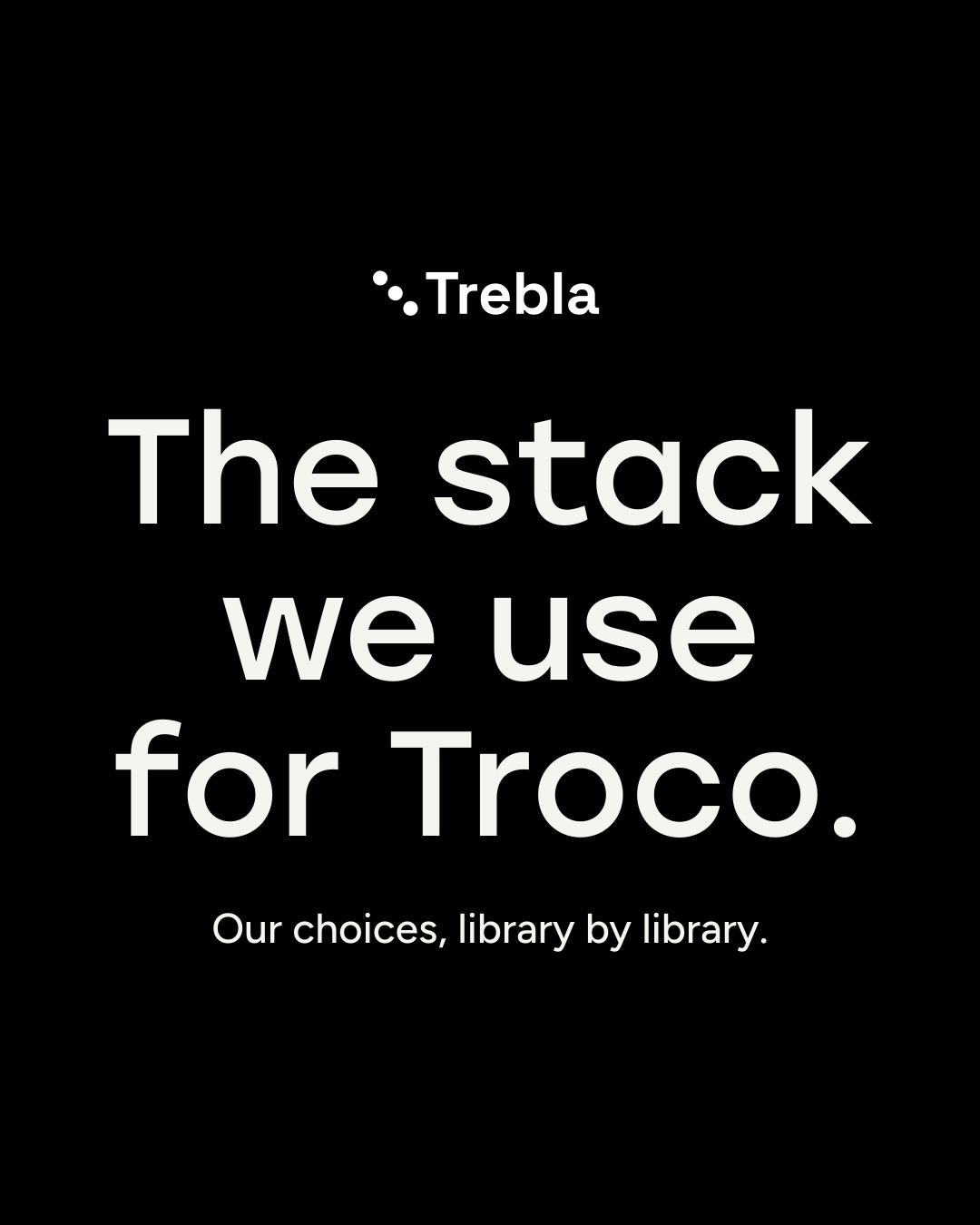
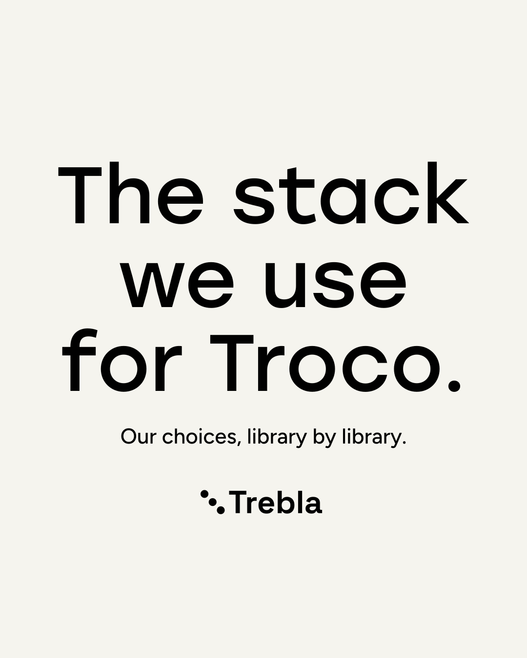
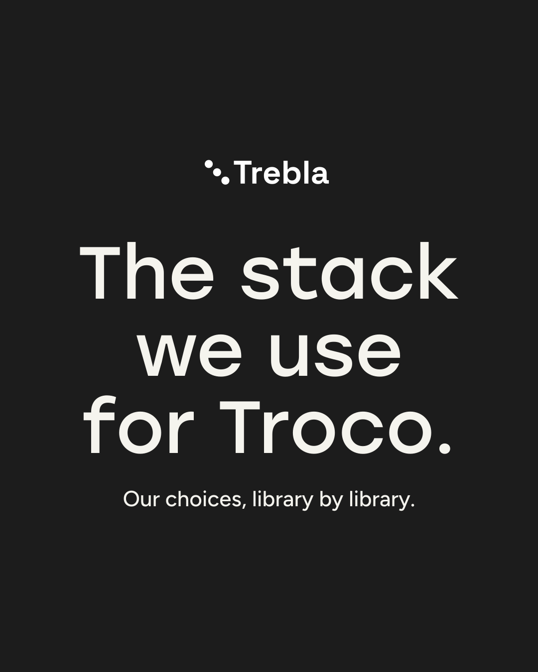
Inside the carousel.
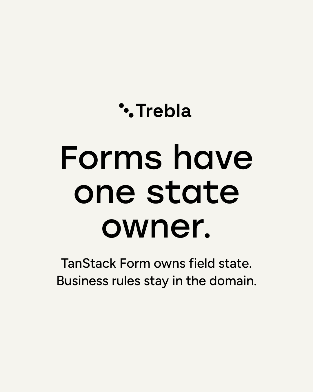
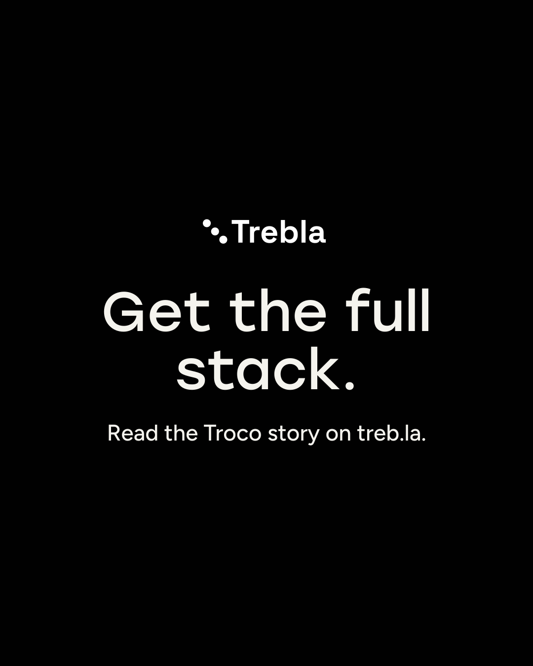
Keep each slide minimal.
Use one short headline. Add a sentence only when it helps. Put longer explanations in the caption or article.
Center the composition.
Center the logo, headline and supporting text as one group on both axes. Balance the headline’s lines; keep phrases together. The background reaches every edge, while the text stays inside the margins.
Check the crop.
Review the feed, profile thumbnail and full-screen view separately. A vertical video needs its own layout, with room for captions and interface controls.
Design specimens rendered by the same templates that create our posts. These examples are previews, not new publications.
Format & safe areas
Feed & carousel
1080 × 1350At least 84 px side margins. Center each slide’s logo and text as a group. Use a flat background without grids or crop marks.
Reels, TikTok & Shorts
1080 × 1920Starting insets: 288 px top, 480 px bottom, 96 px left and 192 px right. Recompose the story here; do not stretch the carousel.
Article & link preview
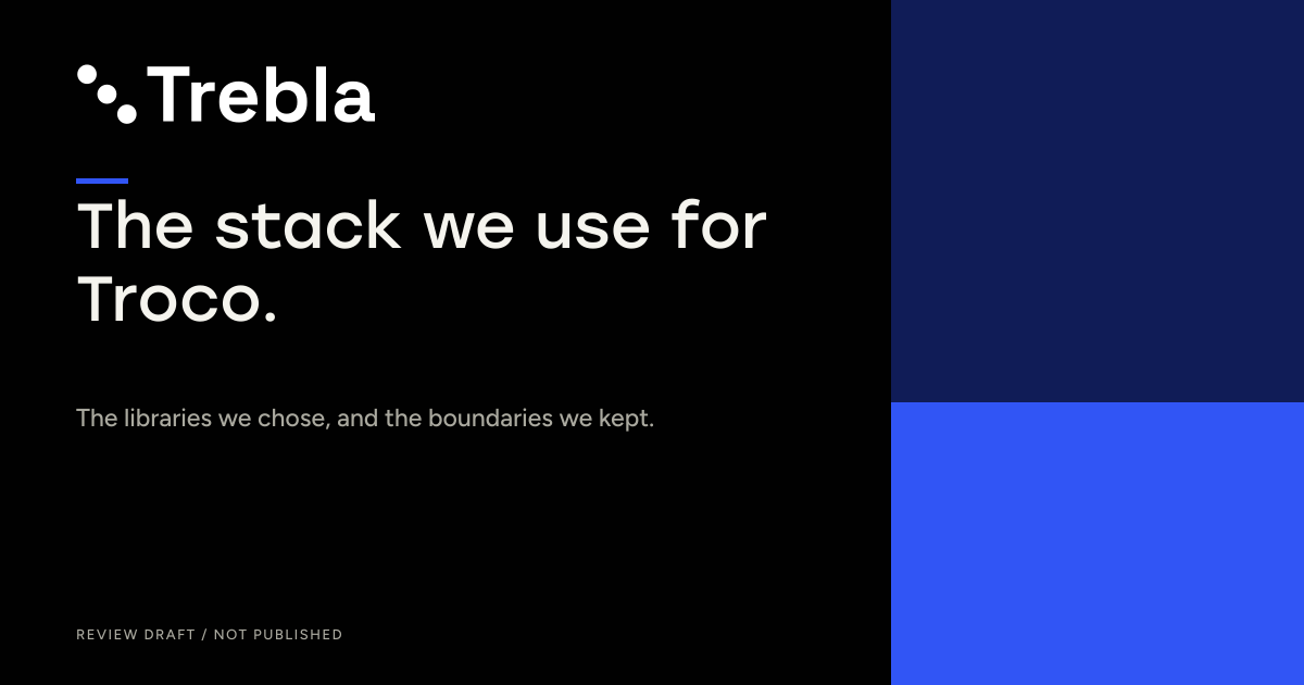
1200 × 63070 px side margins. Keep the headline compact and check the reduced preview size.
Trebla composition margins, not universal platform safe zones. The vertical guide is a conservative starting point; check the current composer with the actual caption and controls before publishing. Guide lines are not part of the exported artwork.
Platform references
Meta and TikTok references cover ad placements; their interface guidance is useful here, but does not guarantee an identical organic-post crop.